Spread Out Cramped Text
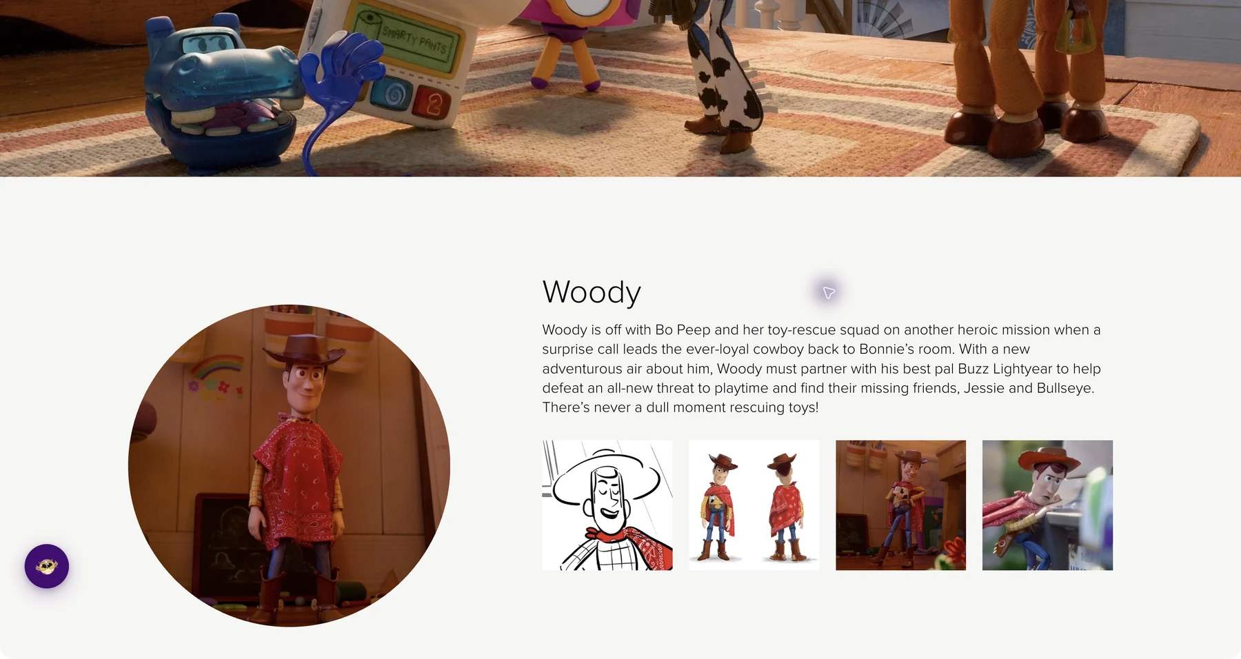
Ever feel like letters on a website are jammed together? Or that lines of text are too close, making it hard to track where you are? You can fix that.
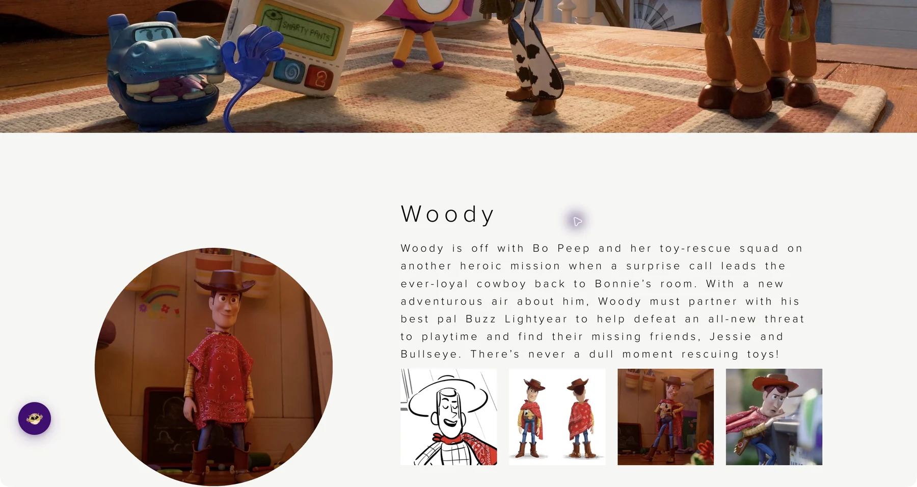
Helperbird lets you adjust letter spacing, word spacing, and line height on any website or PDF. Spread things out until text feels comfortable to read.
Learn how to adjust text spacing
Related features
- Font Size Control - Increase font size to enhance readability alongside improved spacing.
- Dyslexia-Friendly Fonts - Combine spacing adjustments with fonts specifically designed for dyslexia.
- Paragraph Width - Narrow text columns work even better with improved letter and word spacing.
What You Can Change
Letter spacing: Add more space between individual letters. Helps when characters feel like they're blending together.
Word spacing: Increase the gaps between words. Makes it easier to see where one word ends and the next begins.
Line height: Add more vertical space between lines of text. Keeps your eyes from jumping to the wrong line.
You can adjust each one separately, so you can get exactly the spacing that works for you.
Why Spacing Matters
Standard text on most websites is designed for speed, not comfort. Letters are packed tight. Lines are close together. For many people, this makes reading harder than it needs to be.
Research shows that increased spacing helps readers with dyslexia process text more easily. The extra room gives your brain more time to recognize each letter and word.
But you don't need dyslexia to benefit. Anyone who reads on screens for hours knows how tiring cramped text can be.
Who Uses This
People with dyslexia who find crowded text harder to decode.
Readers with low vision who need more visual separation between elements.
Students reading dense academic papers or textbooks online.
Office workers staring at documents and emails all day.
Anyone who finds default website text uncomfortable to read.
Is This Free?
Yes. Letter spacing, word spacing, and line height adjustments are all free in Helperbird.