
Put a Colored Tint Over Any Website
White backgrounds and bright screens can make reading uncomfortable. For some people, it causes headaches. For others, the words seem to move or blur together.
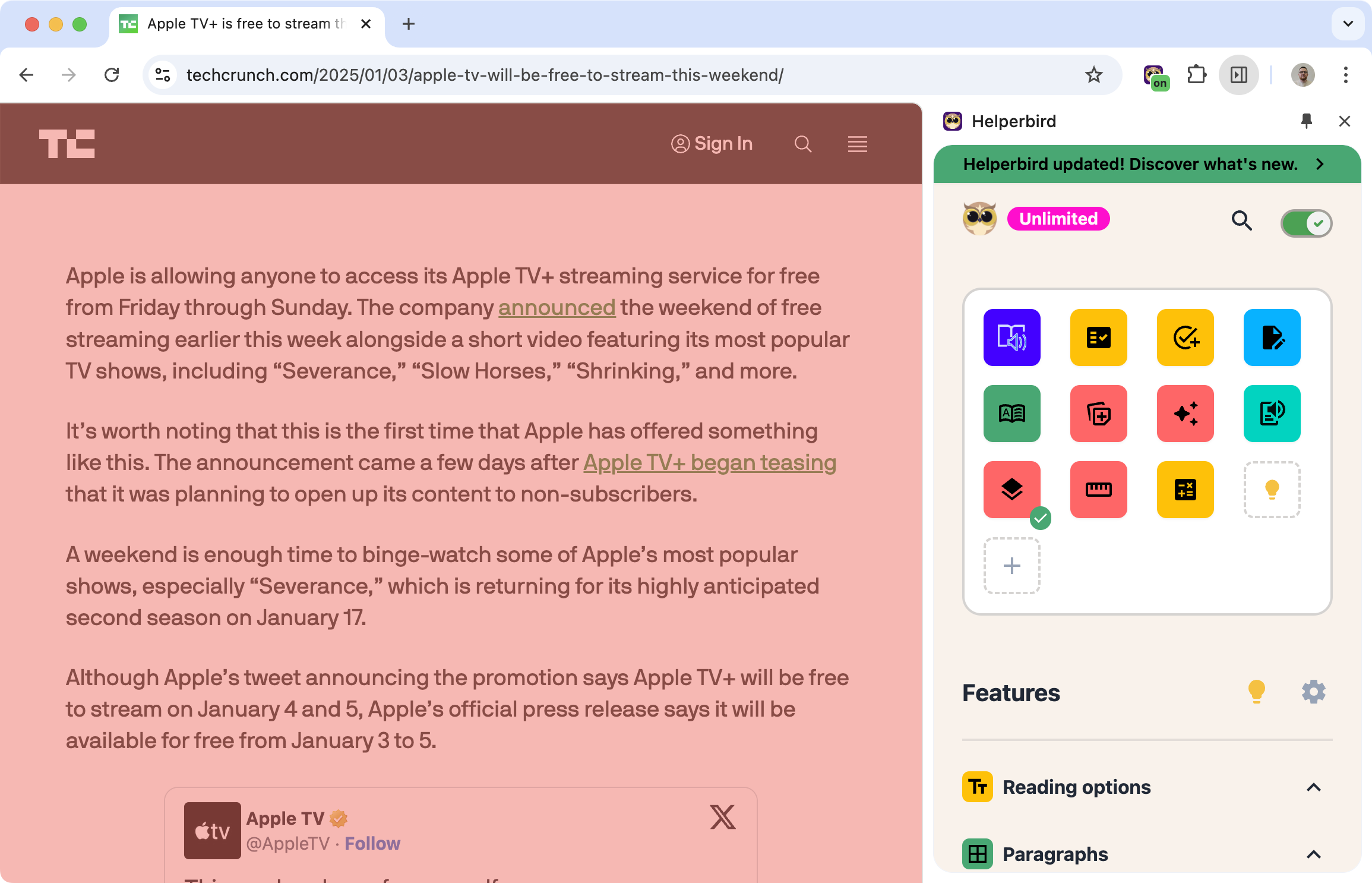
A color overlay puts a tint over the whole page. Many people find that a specific color, like blue, yellow, or pink, makes text easier to read and reduces visual stress.
Learn how to add a color overlay
Related features
- Grayscale Mode - Turn any website grayscale to reduce visual distractions.
- Ruler - Highlight the line you're reading to maintain focus and track your position.
- Reading Guide - A horizontal guide that follows your cursor to keep your place while reading.
- Accessibility Profiles - Apply recommended reading comfort settings in one click.
Why Color Overlays Help
Research shows that colored overlays can make a real difference for certain readers:
Irlen Syndrome (Scotopic Sensitivity): People with this condition see distortions when reading, like words moving, letters changing size, or text appearing to have "rivers" of white running through it. The right overlay color can reduce or eliminate these distortions.
Dyslexia: While not everyone with dyslexia benefits from overlays, many find that a tinted background reduces visual stress and makes reading feel less tiring.
Light sensitivity: Bright screens can cause discomfort or headaches. A colored overlay dims the harsh white background without making text hard to read.
General eye strain: Even without a specific condition, staring at bright screens all day is tiring. An overlay can make long reading sessions more comfortable.
Pick Your Color
Helperbird includes 24 preset colors to try. The best color varies from person to person, so it's worth experimenting.
Common choices include:
- Yellow or cream (reduces brightness)
- Blue (calming, popular for reading)
- Pink or rose (often helps with Irlen Syndrome)
- Green (easy on the eyes for long sessions)
Can't find the right shade? You can also create a custom color and adjust the opacity until it feels right.
Who Uses This
People with Irlen Syndrome who need a specific tint color to read comfortably.
Readers with dyslexia who find colored backgrounds reduce visual stress.
Anyone with light sensitivity or frequent headaches from screens.
Night readers who want a softer screen before bed.
Students and office workers who spend hours reading on screens.
Is This Free?
Yes. Color overlays are free in Helperbird. No subscription needed.