There are few published papers about usability testing with dyslexia focused fonts, but there is a considerable collection of knowledge on dyslexia as well as many suggestions for authoring dyslexia friendly interfaces.Existing accessibility guidelines for dyslexic and non-dyslexic users suggest that dyslexic-accessible practices may redress difficulties encountered by all Internet users.
This paper reviews two existing papers about dyslexia focused fonts (OpenDyslexia font) and accessibility.It will examine the font itself, as well as how the use of the font affects the visual perception, readability, and comprehension of the website and text with general web accessibility.The report is interested in the effects the font has, if any, for people with dyslexia, in comparison with those of Comic Sans or Times New Roman, and on improving human-computer interactions.
Typography
There are few published papers about usability testing with dyslexia focused fonts, but there is a considerable collection of knowledge on dyslexia as well as many suggestions for authoring dyslexia friendly interfaces.Existing accessibility guidelines for dyslexic and non-dyslexic users suggest that dyslexic-accessible practices may redress difficulties encountered by all Internet users.
This paper reviews two existing papers about dyslexia focused fonts (OpenDyslexia font) and accessibility.It will examine the font itself, as well as how the use of the font affects the visual perception, readability, and comprehension of the website and text with general web accessibility.The report is interested in the effects the font has, if any, for people with dyslexia, in comparison with those of Comic Sans or Times New Roman, and on improving human-computer interactions.
It is necessary to be familiar with the particulars of typography in order to understand the importance of font use in web accessibility.Typography is the technique of arranging text for print or on screens for aesthetics and readability.It involves the use of different font types, faces, sizes and layout restrictions such as line height, column width and spacing between characters and colors.
Typography has been around for thousands of years, from stone tablets right through history up to the GUI (graphical user interface).In the context of human-computer interaction, typography has critical importance in some applications.
The primary purpose of a significant proportion of websites and web applications (web apps) is to display/render textual content.Included in this are instructions, labels, and navigation for the web app which can be presented in text (web icons or symbols are in fact a font), and must be readable for users to have fruitful and efficient interactions with the application.
Key Typography Terms
Font face describes the overall letter form, for example, Comic Sans or Times New Roman. Font faces may have serifs (a slight projection finishing off a stroke of a letter in certain typefaces such as Times New Roman) or may be sans serif (Don’t use serifs which are small lines at the tips of characters such as in Comic Sans). Fonts may be display fonts, designed for headlines, or text fonts, designed for large bodies of smaller text. When measuring font size, there are two key areas to focus on: The body size: Measures the full height of letters, from the bottom of the descenders (the part of the character that lies below the baseline) to the top of the ascenders (the part of the character that lies above the baseline) and three additional gutter spaces above and below .
X-Height: The top of the main body height of lowercase letters excluding the spacing or ascenders or descenders.X-Height is a huge factor in typeface regarding readability. The following graphic summarizes the key parts:
What is OpenDyslexia
OpenDyslexia is a free font face designed to mitigate some of the common reading errors caused by dyslexia.It was made with the goal of helping with some of the symptoms of dyslexia.The font is based on the concept that the letters have heavily weighted bottoms to indicate direction.This aids in recognizing the correct letter and which part of the letter is down as it helps your brain from rotating them.Consistently weighted bottoms can also contribute to reinforcing the line of text. The unique shape of each letter in the OpenDyslexia font can help prevent confusion through flipping and swapping as the font is unlike that of other fonts the brain is has seen before. As you can see below.

History of OpenDyslexic
The History of OpenDyslexia’s Development
The font was created by a dyslexic and software developer Abelardo Gonzalez, who released it under an open-source license.The design for the font is based on that of DejaVu Sans, also open-source.
Like many dyslexia-intervention font-faces, most notably Dyslexia or even DejaVu Sans, OpenDyslexia furthers the research of Dyslexia.It is more of a reading aid, but it is to be noted that this is not a cure for dyslexia even though it is very popular.The typeface includes regular, bold, italic, bold-italic, and monospaced font styles. In 2012, Gonzalez explained his motivation to the BBC: “I had seen similar fonts, but at the time they were completely unaffordable and so impractical as far as costs go.
The Theory on OpenDyslexia
The OpenDyslexia font uses heavy weighted bottoms to the font, this, in theory, will figure out fast which part of the letter is down.This helps in spotting the correct letter and sometimes contributes to keeping the users brain from rotating them around.Consistently weighted bottoms can also contribute to reinforcing the line of text.The unique shapes of each letter can help prevent confusion through flipping and swapping.
Pre-existing Studies on OpenDyslexia
There are many reports of the positive impacts of using OpenDyslexia in both traditional media and the within online forms and schools.Currently, as of 7 February 2016, there is no research paper or text-based paper on the effect of the OpenDyslexia that shows OpenDyslexia to be effective with
English readers with dyslexia. One study by Boyarski in 1998 examined the varying features of legacy fonts and modern typefaces designed for digital displays.This study wasn’t planned to determine which fonts were better than others regarding readability. It did offer a scientific way to discern which features of new typefaces affect readability.This scientific method has been used by other researchers in their investigations of the links between typography and readability for dyslexics.
Currently, two major studies have investigated the effect of specialized fonts with students with dyslexia.One paper by Rello and Baeza-Yates written in 2013 titled Good Fonts for Dyslexia, examined the effects of fonts, namely OpenDyslexia, Arial, Times New Roman and Comic Sans on the reading time and eye fixation (i)e.squinting and returning to particular points on a page to double check) of a group of dyslexic subjects from the ages of 12–59.[2] They found that OpenDyslexia did not hugely improve reading time nor reduce eye fixation when reading and processing text.
Fonts for Dyslexia - Rello and Baeza-Yates’ Paper
In the paper co-authored by Rello, Rello noted that dyslexia is a visual reading disability. It is characterized by having difficulties with fluent word recognition and commonly having poor spelling.Also, in the paper it is estimated to affect 10% of the population in the US has dyselxia. During her research for the paper, Rello looked into how different algorithms could be used to replace words with more common synonyms that are hard or confusing for dyslexics.
Rello also investigated the possibility of using eye tracking and facial expression analysis to discover problem areas on the internet for dyslexics and to test the impact of key interface design elements on sample groups of people with dyslexia.The list of variables stated in Rello’s experiments was very complete: paragraph spacing, character spacing, line spacing, font size, type, column width, gray scales color pairs. A summarized version of Rello’s findings is presented in an upcoming paper in which Rello details visual details that make reading online much easier for dyslexics, for example, Rello learned that the larger the font size, the better, up to a point.“’14 pt.` seemed to be the optimal setting” Rello stated.Another significant highlight from the paper was font types;
Rello concluded that italics tended to have an enormous negative impact.Rello noticed that sans serif, monospaced and Roman font styles significantly improved the reading performance of those with dyslexia. Rello stated in the report, that the use of the fonts Helvetica, OpenDyslexia ,Courier and
Computer Modern Unicode are excellent typefaces to make sure your website is dyslexia- friendly, because they are sans serif and their simple, clean design is very easy for the dyslexic eye to process, as it doesn’t have the curves at the end of the tips of the font to cause confusion of processing the text on a webpage. Despite the fact that there were already dozens of available fonts claiming to be dyslexia- friendly, none of them had the backing of scientific proof.Rello’s study was one of the first times that HCI techniques were used to investigate the effects of key aspects of type design on readability for dyslexics, thus providing the basis for designing a font which could potentially make the internet a dyslexia-friendly space.
Special Fonts for Dyslexia - RenskeDe Leeuws
In the second paper, masters student Renske de Leeuw (2010) compared Arial with the font Dyslexie (Dyslexie is a typeface/font designed to mitigate some of the issues that dyslexics experience when reading. It was developed by Dutch graphic designer Christian Boer while in college to help combat her own dyslexia.Rello took 21 Dutch students with dyslexia as her sample group, gave them texts to read in both fonts and monitored the differences in reading speed and accuracy the fonts produced.
Rello found that Dyslexie did not lead to quicker reading, however it did help some students make less dyslexia-related errors, another inserting aspect was from the questionnaires.Renske found that users wouldn’t use the font, because other people, who would have to read their work, would not like the font. This gives the impression that dyslectics are adapting to others, instead of ask for understanding of the use of an adapted font, so that a dyslectic can cope with his/her handicap.
Overall the dyslectics read fewer errors while reading the words printed in the font “Dyslexie”.
Results of the Papers
While there is currently a lack of definite evidence that a dyslexia-friendly font can make a difference to reading rate and accuracy for students with dyslexia, the results of the papers do suggest that these fonts might improve accuracy for dyslexic students if not reading times: further research is needed to determine whether this is actually the case.
However, it is clear that the variable design elements of fonts impact dyslexic students in some way, therefore the creation of an effective dyslexia-friendly font should be possible, if there were enough research to indicate which elements have negative or positive effects.
The Effect of Optimal colors on Readability
Another important area in web accessibility is color.This is dealt with in the research report by the W3C communities (Web developers who make the W3C specifications).
In the study, they analyze how the aspects of text customization, text and background colors can improve readability for people with dyslexia, through different color mixes and brightness levels.In previous studies, it came to light that particular text and background color combinations can be beneficial for reading on the screen for those with dyslexia. Several text customization suggestions agree that users with dyslexia prefer lower brightness color differences between the text and the background compared to the average user (British Dyslexia Association, 2012).It must be noted that no studies have been carried out upon the relationship between this preference and the minimum color luminosity ratio which the W3C suggested would be suitable for dyslexic users.
W3C Study
In the study taken by the W3C, they got 200 people and showed them several pieces of text with different color combinations and asked them which they preferred to read along with reading time.
They then tested previous recommendations and compared them with the W3C algorithm (The W3C algorithm suggests avoidance of brightness differences less than 125 and color differences less than 500).
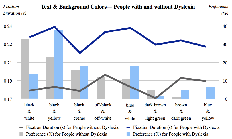
The user performance and preferences from the tests, among the different color values across people with and without dyslexia are shown in the chart below.
In the report, the areas of focus were broken down as follows
In the report, the areas of focus were broken down as follows:
The performance, measured in reading time Preferences, represented by the percentage of participants who chose certain colors
Eye movement (Performance)
Shorter fixations are preferred to longer ones, as according to other studies, readers pause longer at points where processing loads are larger.In their results, it was evident the greatest difference among groups is on the black and white pair, as seen in the chart.Most of the users tested who didn’t have dyslexia (32.5%) preferred a color mixture and only 13.5% of people with dyslexia choose black text on white background in terms of text.
Accessibility needs and Personal Preferences and Testing
The testing approach is designed so that accessibility needs and personal preferences can be studied separately, rather than being mixed up as they frequently are in recommendations regarding colors and readability. The tests were composed of two parts: Set of texts to be read with the use of the eye-tracking to study the reading performance. A survey to collect the user’s preferences.
Shorter fixations are preferred to longer ones, as according to other studies, readers pause longer at points where processing loads are larger.In their results, it was evident the greatest difference among groups is on the black and white pair, as seen in the chart.Most of the users tested who didn’t have dyslexia (32.5%) preferred a color mixture and only 13.5% of people with dyslexia choose black text on white background in terms of text. The benefit of this separation is that they could see whether there was a difference in reading speed and accuracy before and after color customisation, which in turn allowed them to determine trends in color choice.
It must also be noted that during these experiments, the color pairs were displayed randomly rather than in order of brightest to darkest or vice versa, because that would have allowed the subjects’ eyes to adjust to each setting and it they would not have been able to make a judgment as to which colors are most advantageous to their reading.
Possible problems with the tests include:
The texts used are too small to draw firm conclusions. The texts were alone on the screen. Thus, the researchers couldn’t predict the effect of color differences in other reading contexts such as web browsing, where there are multiple color schemes on the page.
Results of Study
The outcome of the results from the paper (see figure 1) did not match the WC3 algorithm. Brown and Dark presented high fixation for both groups; that was second and third highest for people without and with dyslexia.
These colors were also hardly selected by the users, with only 4.55% without dyslexia and 0.99% of the users with dyslexia. However, one surprising outcome of the study was that the pairing of dark brown and light green, which is very similar to the brown and dark green pair in terms of the color hue but different in terms of brightness and color contrast, presented the lowest and second lowest fixations duration for people with dyslexia and without dyslexia.
The results suggest that text customization preferences need to be complemented by measured data from actual reading performance since there is no correlation observed between the reading performance and the personal choices of users with dyslexia. In the research it was also reported that the use of colors should be taken into consideration by UX developers.
It was even noted that if the users with dyslexia seem to be reading more quickly using lower color contrasts than the control group of users these are not below the W3C algorithm, which is to avoid brightness differences less than 125 and color differences less than 500.
My Research
Shorter fixations are preferred to longer ones, as according to other studies, readers pause longer at points where processing loads are larger.In their results, it was evident the greatest difference among groups is on the black and white pair, as seen in the chart.Most of the users tested who didn’t have dyslexia (32.5%) preferred a color mixture and only 13.5% of people with dyslexia choose black text on white background in terms of text. In my own research, I followed the methods used in the other papers, in order to discover if my results might back up their findings.
I developed a survey, which consisted of 12 questions ranging from details such as age to the color combinations they preferred to use.
I also showed them samples of Ariel and Comic Sans alongside samples of OpenDyslexia and asked them to pick the one they preferred, similar to the method from Renske De Leeuw’s paper. In total, I got 43 people to take the survey by posting the link on Reddit sub categories for both dyslexia and web design.I allowed for a section for personal comments so that I could get a better understanding of what the user thought of the fonts.One user wrote “ I don’t like using OpenDyslexia all the time because I feel like It’s not very discreet, using it would be immediately obvious to everyone that I was ‘different.` For the most part, the results followed the same patterns as that of the papers cited, with the exception of the W3C study, where the results were mixed, as dyslexia is different from person to person.
The people who were surveyed did not stick to the standard 12px body but preferred the 14px body size which was inline with the recommendation of that from Rellos paper.
Conclusion
The results of the existing research and the research of this paper into dyslexic focused fonts in terms of web accessibility for dyslexics can be put into effect by developers to improve the readability of their applications in both software, website or web application for those with dyslexia.
Web accessibility recommendations
Some recommendations from the above mentioned papers include:
Choose a common font with recognizable letter forms for large bodies of text, such the OpenDyslexia font, comic sans or Arial.
Include the option for different fonts Allow the user to choose between color combinations Set the body text size to least 14px, instead of the existing 12px.
Present blocks of texts in columns; don’t let text span the entire length of the screen on a widescreen display, allowing for better use of whitespace.
Choose text and background colors with a high luminance contrast, or better yet allow the user to select the combination. Use lower case letters.
Avoid the use of capital letters.Using all capital letters make it harder to read for people with dyslexia.
Double spacing after periods. Avoid pure black text on a pure white background (Many dyslexic users can be sensitive to the brightness the high contrast colors cause, as stated in the W3C report as well.
Avoid Serif fonts ( A sans-serif font would allow dyslexic users to see the shapes of letters more clearly.This is because of the lack of hooks increases the spacing between letters and makes them more distinguishable.
As is evident from the suggestions, there are multiple possible avenues for future studies on typography for dyslexic users, and in fact, such research is desperately needed in order to create a web which is universally accessible.
Despite the fact that the research papers cited and lack of existing research do not offer concrete evidence of a correlation between readability for dyslexic users and the use of dyslexia-focused fonts, there are so many people suffering from dyslexia and even more having trouble reading on the web, that web designers and developers should feel obliged to make their websites accessible to everyone by fixing bad practices or at least considering the above mentioned suggestions.
Aside from developing more user friendly fonts, true web accessibility entails always providing users with several options so that they can customize the website to suit their needs. This report should offer an insight into the way dyslexic users experience the web and demonstrate how dyslexic focus fonts try to fix some of their problems and improve web accessibility in general.
Bibliography
K.O.Connor, “www.")typographydeconstructed.")com,"[Online].")[Accessed 21 April 2016].")
L.R.&.R.Baeza-Yates, “Good Fonts for Dyslexia,” Web Research Group, Barcelona, Spain, 2013.")"Learn more on the topic featuring Helperbird")
A.GONZALEZ, “FAQ | OpenDyslexic,” 03 June 2006.[Online].[Accessed 01 April 2016].")
A.GONZALEZ, “OpenDyslexic | About,” 01 June 2006.[Online].[Accessed 12 Januray 2016].")
[J.J.W.J.A.Diliberto, “The effect of a specialized dyslexia font, OpenDyslexic, on reading rate and accuracy,” 15 October 2015.[Online].[Accessed 01 Januray 2016].
R.d.Leeuw, “Special Font For Dyslexia?,” 5 December 2010.[Online].[Accessed 13 Januray 2016].")