
How to Use Helperbird's High Contrast Themes
High contrast recolors any web page so text stands out. Compare the five themes, find the one that suits your eyes, and see how it differs from Dark Reader.
On this page
What High Contrast Does
Some websites put pale grey text on a white background.
High contrast recolors the page so the text stands out. You pick one of five themes and the page changes straight away.
The theme stays on until you turn it off, so the next page you open looks the same way.
Turning it on is free.
Who is This For?
This is helpful for:
- People with low vision
- Anyone who finds bright pages painful to look at
- Anyone who reads better with the color taken off the page
- Anyone reading in strong light, where pale text washes out
Turn On High Contrast
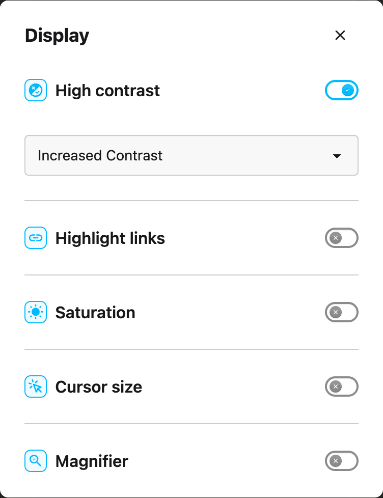
High contrast lives in the Display panel, under All Features in the Helperbird menu. Turn on the High contrast toggle, then open the box under it and choose a theme.
 View full-size image (opens in a new tab)
The box shows Increased Contrast before you choose, but the page uses Greyscale. Choose a theme yourself, even the one already showing.
For the same steps with a screenshot at every stage, see how to enable high contrast mode.
Keyboard shortcut
Press Option + 7 on a Mac. On Windows, Linux and Chromebook, press Alt + Shift + 7. Either one switches High contrast on and off.
The shortcut changes the page you are on. It does not change the saved setting, so the next page you open follows the toggle in the menu.
You need Helperbird Pro for the shortcut, and keyboard shortcuts turned on.
The Five Themes
| Theme | What you see |
|---|---|
| Increased Contrast | Colors stay, but go deeper. Text stands out more against a light background. |
| Greyscale | Color comes off. The page is black, white and grey. |
| Inverted Color | Every color flips to its opposite. A white page turns dark, and a page that is already dark turns light. |
| Inverted Greyscale | Color comes off and then flips. You get light text on a dark background. |
| Yellow on Black | Yellow text on a black background. |
If you are not sure where to start, try Increased Contrast first. It keeps the colors the page already has, so the page still looks like itself.
High Contrast or Dark Reader?
Dark Reader paints pages dark, with its own dark themes and brightness controls. It flips nothing, so a page that is already dark stays dark. See how to turn on Dark Reader.
High contrast changes the colors that are already on the page instead. It can take color off, flip color, or push the colors further apart.
So use Dark Reader to read at night. Use High contrast when you want the color gone, the contrast pushed up, or yellow on black.
Dark mode is a third, separate setting. It changes the colors of Helperbird's own windows, not the websites you visit.
What It Does Not Change
You cannot apply the theme to the text only. Menus, buttons and ads change with it.
Greyscale, Inverted Greyscale and Yellow on Black recolor photos and videos too. Increased Contrast and Inverted Color leave most photos and videos close to their own colors.
Video Tutorial
Need Additional Help?
If you have any questions or run into any issues, please contact the Helperbird support team. You can reach us at Helperbird support. We are happy to help you get the most out of Helperbird.
Printed from the Helperbird Help Center · Updated September 22nd, 2026
Questions? We are happy to help — helperbird.com/support