How to Use Dyslexia Friendly Fonts with Helperbird
Helperbird has 32 fonts, including OpenDyslexic, six Lexend widths, Andika and Atkinson Hyperlegible. See which to try first and where fonts do not work.
·
- features
- reading
What Makes a Font Easier to Read
Letters like b and d can look like mirror images.
A dyslexia friendly font pulls those pairs apart. Some weight the bottom of every letter, so it sits the right way up. Others widen the space around the letters so words stop crowding.
No font suits everyone. Try two or three, then keep the one that tires you least.
The Fonts Worth Trying First
You get 32 fonts. These are the ones drawn for readers who find text hard to read.
| Font | What it does |
|---|---|
| OpenDyslexic | Every letter has a heavy, weighted bottom, so b, d, p and q are harder to swap. |
| The Lexend fonts | Six widths, listed as Deca, Exa, Giga, Mega, Zetta and Peta. The letters and the gaps between them both get wider. Deca is the tightest, Zetta the most open. |
| Andika | Drawn for people learning to read. Shapes that usually look alike are kept apart. |
| Atkinson Hyperlegible | From the Braille Institute, drawn for low vision. Capital I, lowercase l and the digit 1 all look different. |
| Comic sans | Not designed for dyslexia, but its letters are less uniform than most sans-serifs. |
You also get a bold and an italic version of OpenDyslexic, Andika and Atkinson Hyperlegible.
Start with OpenDyslexic or Lexend Deca. If the words still crowd, try a wider Lexend such as Giga or Zetta.
The rest are everyday fonts such as Arial, Georgia, Verdana, Lora and Palatino.
On iPad and iPhone you get 29. The three Lora fonts are left out.
How to Turn on Font
Turn Font on in Text settings, then pick one of the fonts above. How to Change Fonts on Any Website lists all 32 and shows each step with screenshots.
Each name is drawn in its own typeface, so you can see the shapes before you choose. A green check marks the one in use, and the page changes as you click.
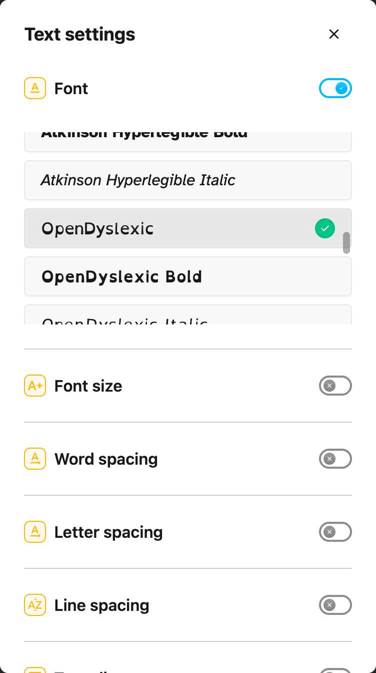
Font is in the free version. OpenDyslexic, Andika and Atkinson Hyperlegible also set the line height on the page to 1.5.
If a new font does not help you, spacing often does. How to Use the Text Settings in Helperbird covers the rest of the panel.
The Helperbird Google Docs and Slides add-on has a Dyslexia button that applies Lexend Deca. It changes the whole document in Docs, the open sheet in Sheets, and the whole slide in Slides. Selecting text first makes no difference.
Where the Font Does Not Apply
- Google Docs, Slides, Sheets and Forms. In Docs, Slides and Sheets the toggle is replaced by a Better in the Google add-on badge.
- PDFs. The toggle is replaced by a Not available on this page note. A Helperbird Feature is Not Supported explains what that note means.
- Icons and symbols. Most icon fonts are left alone, so they do not turn into letters. A site using an unusual icon set can still end up with icons showing as characters.
Video Tutorial
Need Additional Help?
If you have any questions or run into any issues, please contact the Helperbird support team. You can reach us at Helperbird support. We are happy to help you get the most out of Helperbird.
Printed from the Helperbird Help Center · Updated September 22nd, 2026
Questions? We are happy to help — helperbird.com/support