
How to Change the Text and Style in Immersive Reader
Learn how to change the text size, spacing, font and background color in Immersive Reader, so the page is comfortable for you to read.
On this page
What This Panel Does
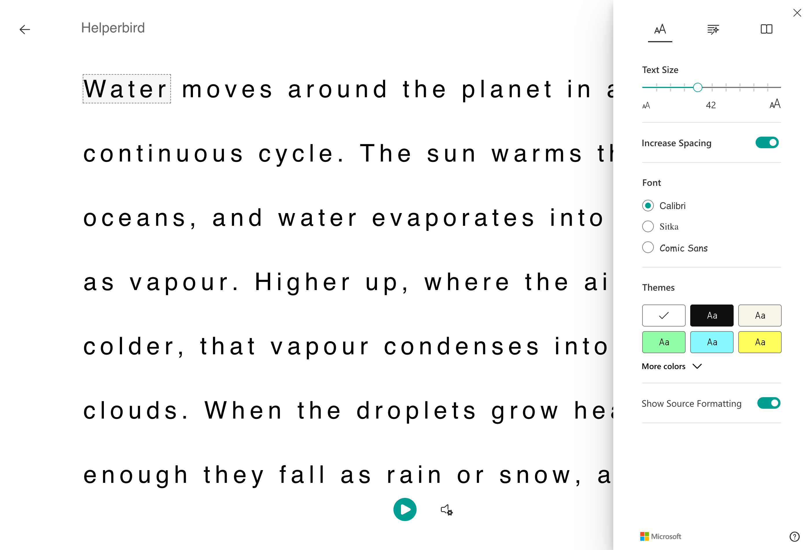
Text Preferences is the first of the three buttons, marked AA. It controls how the words look: how big, how spaced out, in what font, and on what color.
Who is This For?
This is helpful for:
- Anyone who needs larger text than a website gives them
- Readers with dyslexia, who often read more with wider spacing
- People who find black on white harsh or glaring
- Anyone reading for a long stretch
Open Text Preferences
Open Immersive Reader first. You can start it from the floating toolbar, from the Helperbird menu, or from the Tools menu in the PDF Reader.
Once it is open, the three buttons in the top-right corner hold every setting.
Click AA.
 View full-size image (opens in a new tab)
Text Size
Drag the slider. The text resizes as you drag, so you can stop when it feels right rather than guessing at a number.
Go larger than you think you need. Immersive Reader reflows the text to fit, so nothing is cut off, and larger text is one of the cheapest ways to read for longer without tiring.
Increase Spacing
This widens the gaps between letters, words and lines together.
It is worth turning on even if the text looks fine to you. Crowded letters are a common reason words seem to swim or swap places, and spacing them out is often more effective than making them bigger.
Font
Three choices: Calibri, Sitka and Comic Sans.
Comic Sans is there for a reason, whatever its reputation. Its letters are less symmetrical than most, so b, d, p and q are harder to confuse, which some readers with dyslexia find genuinely easier.
If none of the three suits you, Helperbird has a much wider set of fonts for ordinary web pages.
Themes
The color swatches change the page and text color together. More colors opens the full set.
A cream or soft color instead of white reduces glare, which helps if you get visual stress or find white pages uncomfortable. Black is there for reading in the dark.
Show Source Formatting
On by default. It keeps the bold, italics and headings from the original page.
Turn it off if you want every word to look identical, which some readers find calmer.
Next: Grammar Options and Reading Preferences.
Need Additional Help?
If you have any questions or run into any issues, please contact the Helperbird support team. You can reach us at Helperbird support. We are happy to help you get the most out of Helperbird.
Printed from the Helperbird Help Center · Updated September 22nd, 2026
Questions? We are happy to help — helperbird.com/support